Selection screen can be used interactively
The tags <choice> involve a set of form components. During the Parameterisation the user can chose different #variables#. The figures below demonstrate how the <choice> form components are represented in the form. This is illustrated with the choice Igname in figure 1.

A selection can be chosen in the function <choice>. Here exemplified the choice of different crops.

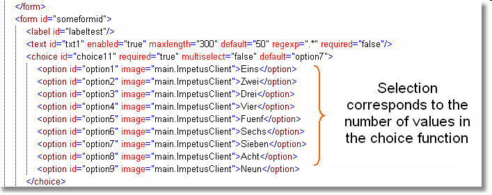
In the XML structure the chosen components are listed.
(In the example named "one" to "nine")
In the XML structure the form components are summarised in the usual way. This example shows the variables that can be selected under "option 1", "option 2", ... to "option 7". In the first figure the options are already specified.
Other possible ways of presenting the information are, for example:

A simple or multiple choice is possible with radio buttons as displayed above
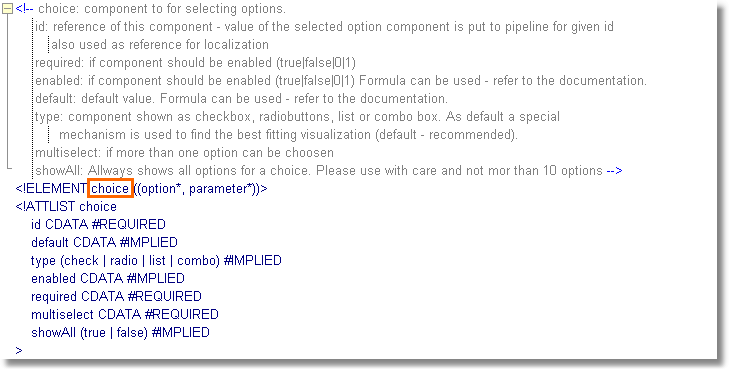
The DTD structure employs the basic structure of the form component <choice> as usual. The attributes can be found in the list below:

The form component <choice> in the DTD- structure with its entire attributes and their explanations are listed in the graph above